My Melvin Book
Thursday, December 5, 2013
Thursday, December 27, 2012
Monday, December 24, 2012
New Story: Melvin and the Big Fish Fry
Design Elements: First the big fish design: Currently, I have no specific fish species in mind. It needs to be just "a bully fish" with no real tie to a specific breed of fish.However, with that said, I lean towards a catfish or barracuda, or a shark like style. But it may end up being something completely different. It will be the "look" more than anything. I want a good form more than a "type" of fish. I don't want arguments over what kind of fish it is.. just that we all agree, "it's a fish"..All of these drawings were done today at the kitchen table. I was trying to get a feel for some thing. It runs the gamut of Jabber Jaw shark to catfish, Nemo's Angler fish to the bully Tex Avery Fish with hook in lip like a cigar.

Snapping Turtle designs:
The turtles are definitely snappers. I started out just drawing my idea of a turtle but they all ended up looking like a bird or Gonzo the Great. So I got out my trusty field guides. Turns out turtle skulls are more cylindrical and the snappers are more triangular. Snapper eyes are much smaller than a box turtle or a mud turtle, mostly because they like murky waters and do not rely on eye sight to hunt. The soft shell turtle is a very odd looking creature and that type of turtle would not have the appeal I am looking for. My snappers have to be likable even though they are trouble. After a few tries I started to get a look I was happy with. Next I got to work on the shells and legs and feet. This is not bad for a days work.


Monday, February 20, 2012
Week of Feb 19-25, 2012
I have been working specifically on the manuscript for the last two weeks. I am happy with the progress. I needed to lay out the entire story in better detail to determine the number of important images that I need to create.
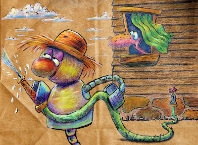
Over the week end I was able to create several images that i am very happy with. I feel they are some of my best work yet. The house is still a work in progress.
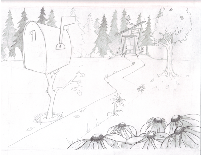
2/18/2012: Work in Progress: This will be the establishing shot for Melvin's house.
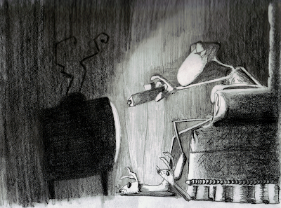
2/17/2012: This is a rework of Late at night with Melvin and the T.V. 
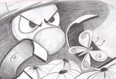
2/17/2012: This image is a rework of the Bot's first strike against unsuspecting butterfly.
Wednesday, February 1, 2012
Background test
This image is my original sketch of the establishing shot.
This is my first attempt to create a Digital background of the establishing shot for my Melvin story. (Click image for closer look.)
This is a quick sketch of Melvin where I am testing out more flexibility in his body. I want his whole body to be apart of his motions. This is an attempt to create a flow of his body posture with his body movement. In this image he is looking off camera to the left creating a strong flow through his body.(Click image for closer look.)
This image is of tree concepts. The one with a check mark beside it is one I think I will develop further. I like the flat termination point of the branches from the trunk and the square shapes for the canopy.(Click image for closer look.)
This image is for concept of Melvin's house. I want the house to be of irregular shape contrasting his more organic form. I want the shapes to be geometric and blocky and completely unrealistic but still capture the essence of a basic house.(Click image for closer look.)
Monday, January 30, 2012
Melvin test Digital 100% version
The image below is my first attempt to create a 100% digital version of Melvin. This is a test to learn a basic work flow and create a color palette for this book. My Style is based on my fondness to the old Pink Panther cartoons and their wonderful use of minimalistic techniques. I want to give just the right amount of information to help support the story and not over saturate the viewer with details. I want the reader to create the world with only a little help from me. The Artist
Tom O'Loughlin is responsible for the backgrounds of many pink Panther cartoons and it is in this style I wish to carry on this tradition in my stories. Click the image to get a closer look. 
The image below is a variety of screen captures from the Pink Panther cartoons. In my selection I tried to find backgrounds that would be similar to my story elements and future ones. For example, pine trees and deciduous trees , a house, and the basic flora ground cover and the rendering of cityscapes. In addition, Like the way the rocks were handled as well as the jungle type environment.Click the image to get a closer look.
This study has helped me, but trying to find a way to incorporate stylistic elements without copying is challenging. In the end, I need my work to have an essence of these ideas without loosing my own individual style in the process. The point is not to copy but add to my own skills with these new ideas thus creating, within me, a new seamless, composite style of my own.
My biggest goal is to create a workflow that is efficient for me. So that means every image must:
- Provide the viewer with just the right amount of information. I really want minimalistic elements but what I keep doing is overkill, or just flat out uninspired, copying. I have to be brave to follow my own heart and be myself and not be someone else.
- Be possible to create in a reasonable amount of time. ( i.e. I would like to be able to finish one entire drawing in a day)
- It can not be riddled with technological difficulties: This does not mean I do not learn new techniques, but it does mean that the drawing does not suffer from loss of the initial impetus. Regardless of the media, the drawing must tell the story first. If it does not do so, it is unsuccessful no matter how "cool" it may look.
Thursday, January 26, 2012
Study of Artists and Style
These artists are not in any particular order.
- Moe Willems:I love his style and looseness and his simple but well written stories. he was also a PBS Sesame Street writer and animator.
- Quentin Blake: Illustrator of Roald Dahl books.
- Charles Schultz

- Dr. Seuss
- Betsy Lewin: Illustrator for Click, Clack, Moo, Cows that type by Doreen Cronin.


